Vivian Maier Exhibition Brochure
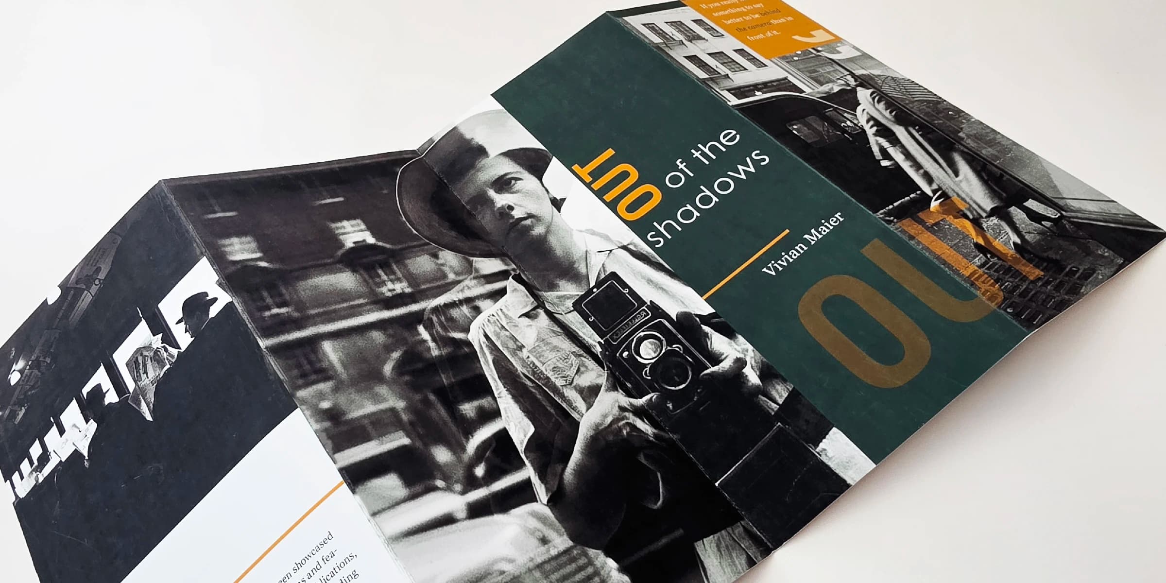
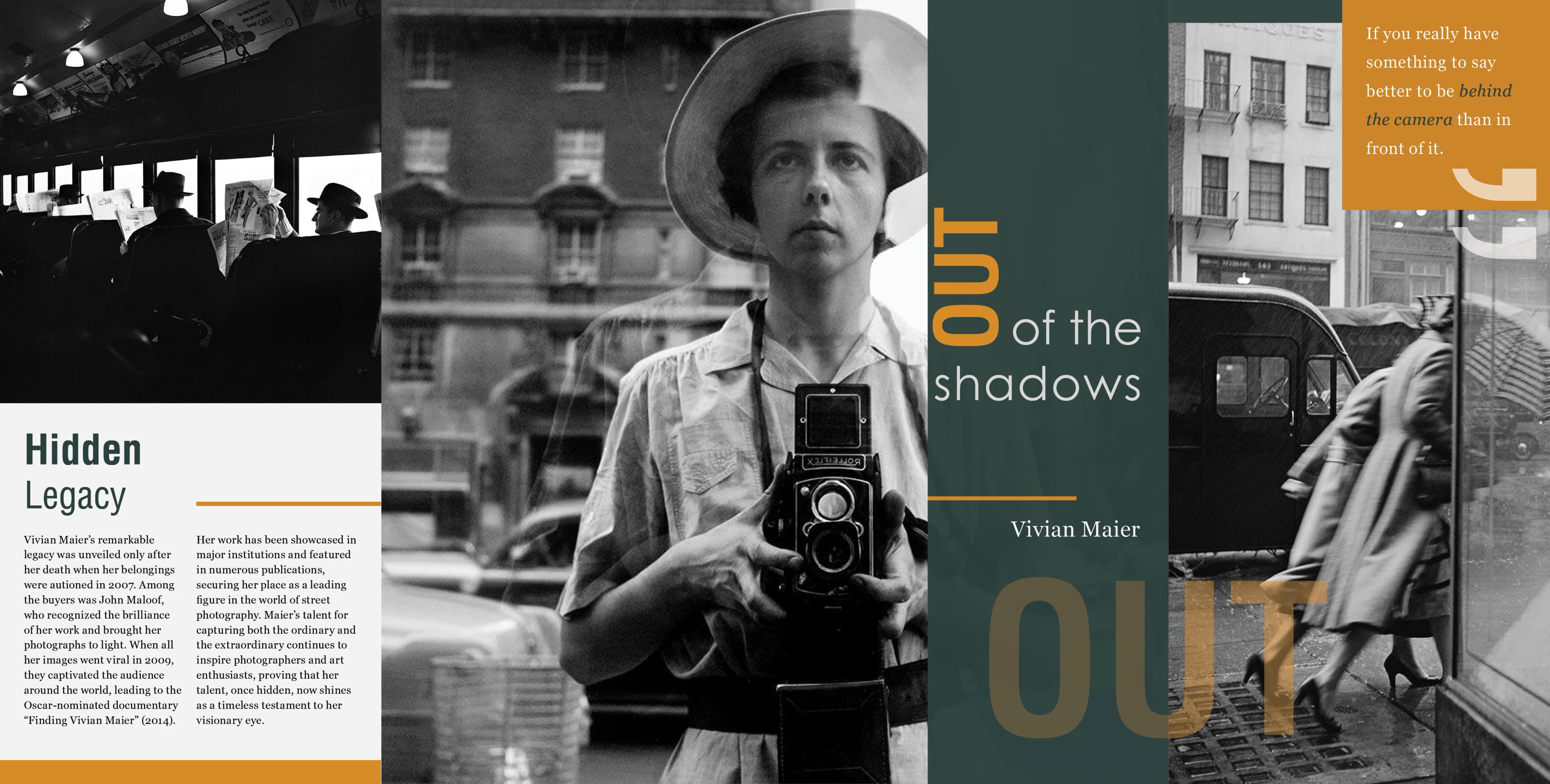
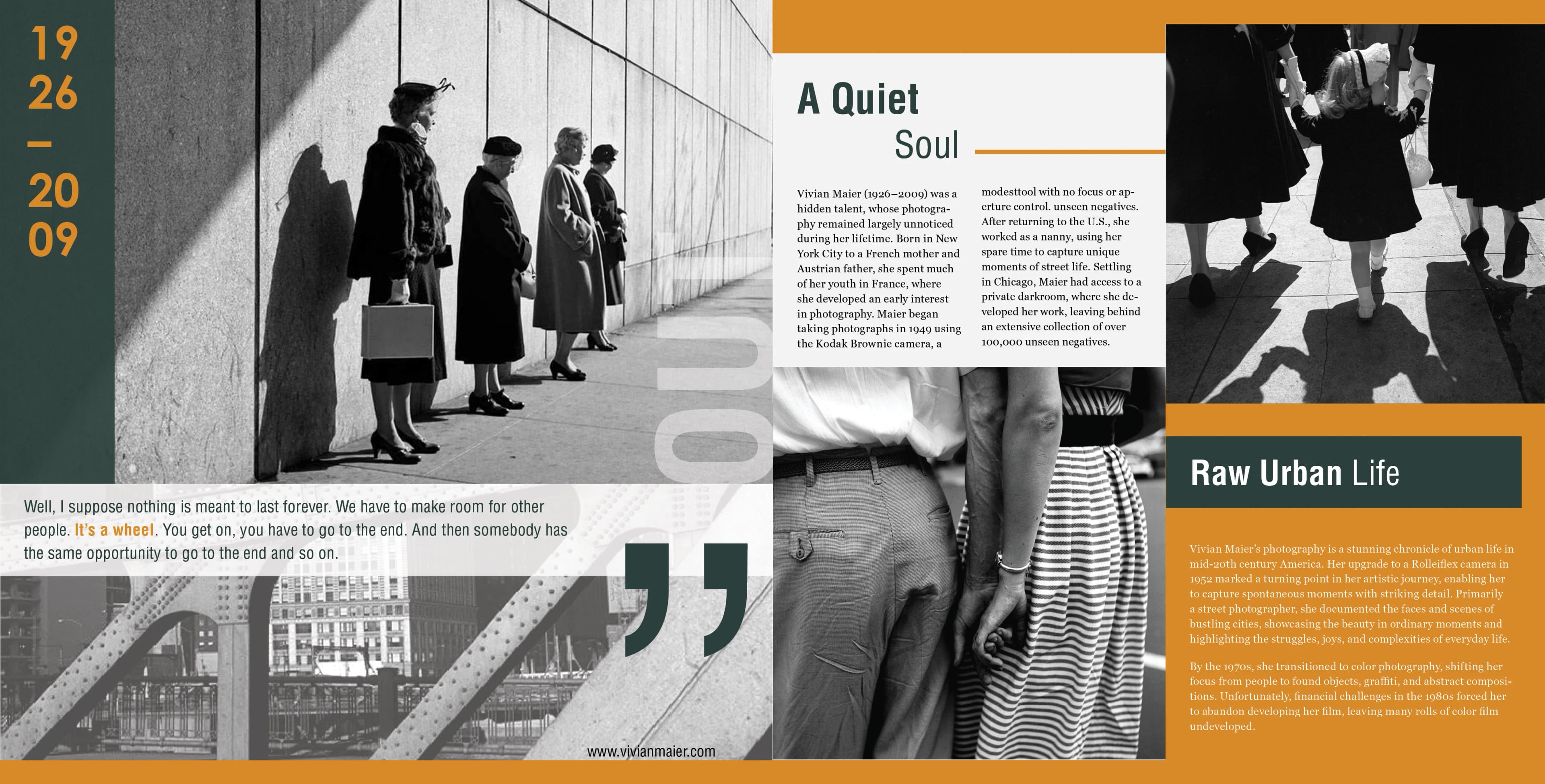
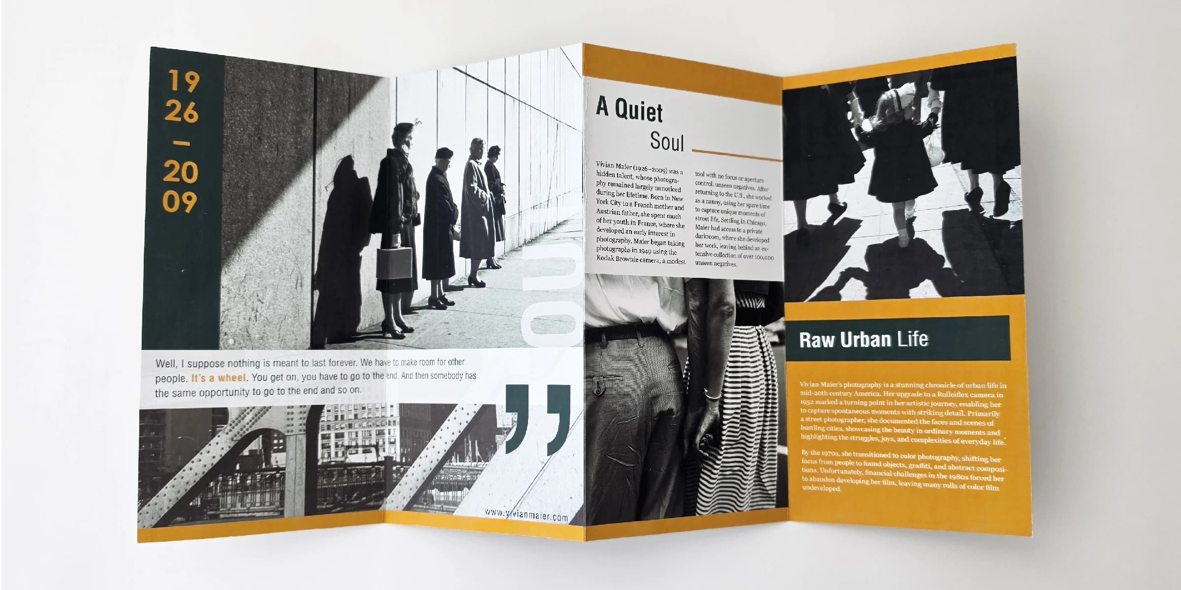
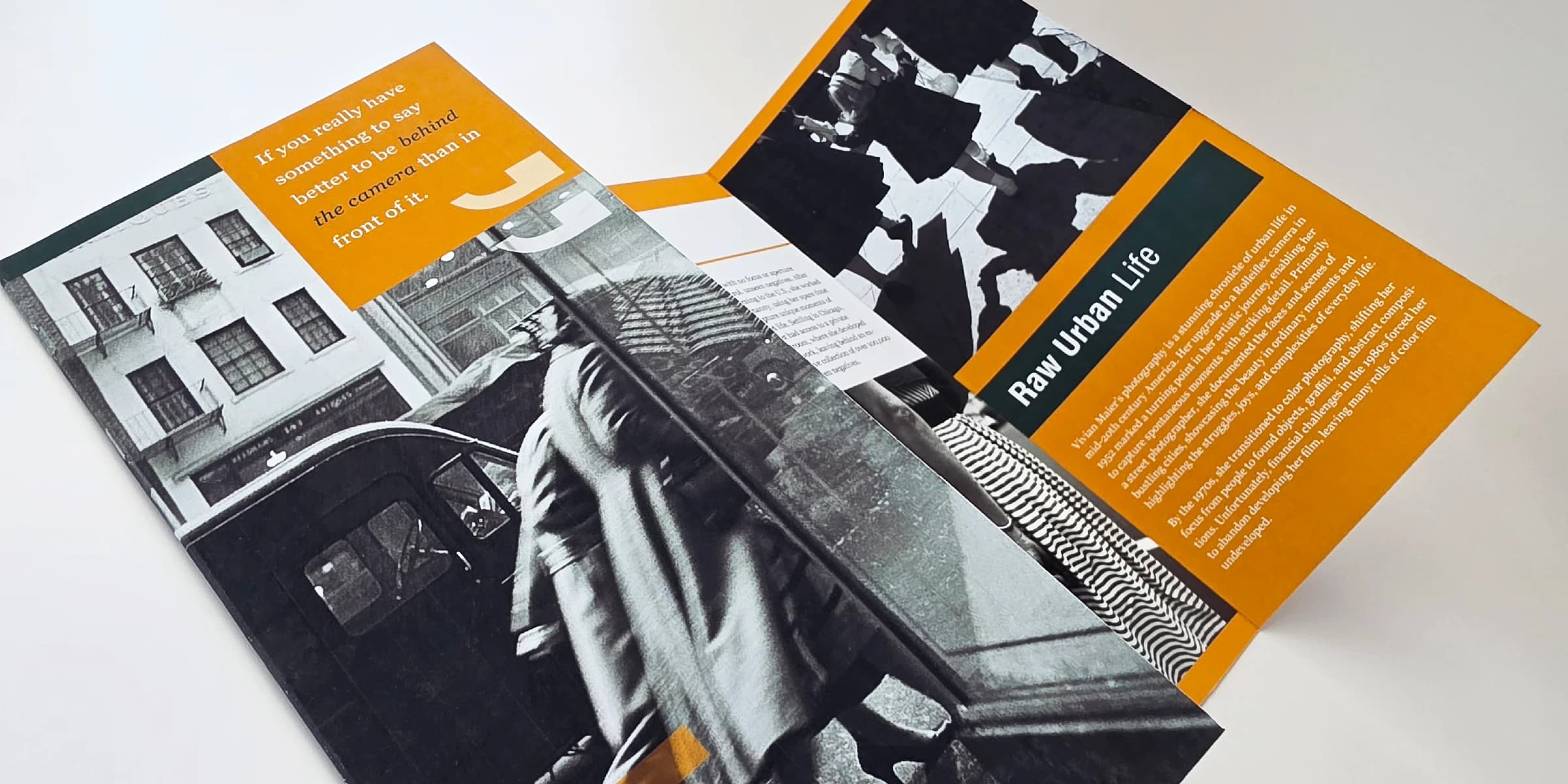
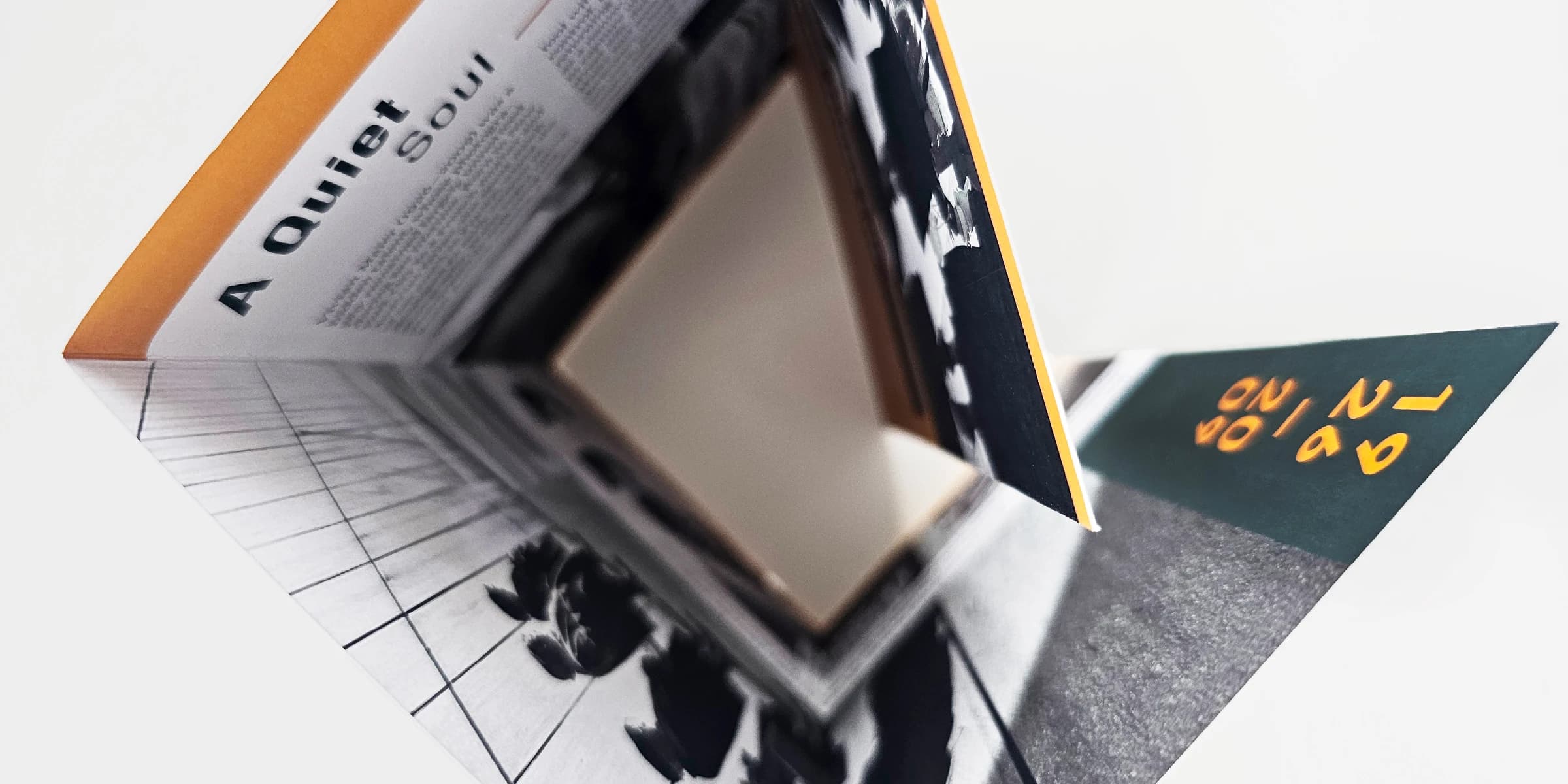
This brochure was designed to present Vivian Maier’s photography in a way that feels clear, balanced, and easy to move through. Her photographs captured everyday life, city streets, reflections, shadows, and small moments that might normally be overlooked, so the design needed to support that quiet strength without becoming too dominant. A structured grid and strong visual hierarchy were used to organize the content and guide the viewer through the brochure in a natural way, while still keeping the photographs as the main focus.
One of the most important design choices was the use of burned yellow as an accent color, inspired by the way it often appears in Maier’s mostly black-and-white photography. That color helps create small moments of emphasis throughout the brochure while still feeling connected to the imagery itself. The layout was also designed to feel visually balanced across the spreads, using contrast, spacing, and shifts in scale to keep the piece engaging without overwhelming the content. Overall, the brochure was meant to reflect both the visual power of Maier’s work and the sense of discovery that surrounds her story.